Problem
Karpaz needed a stronger digital presence that could communicate value, professionalism and commercial direction clearly.
technical case study
Landing Page • Branding / Business website
Premium landing page for Karpaz's digital positioning, focused on a value narrative, commercial clarity and a strong visual presence.

Above the fold of the landing page, focused on positioning, visual impact and a clear call to action.
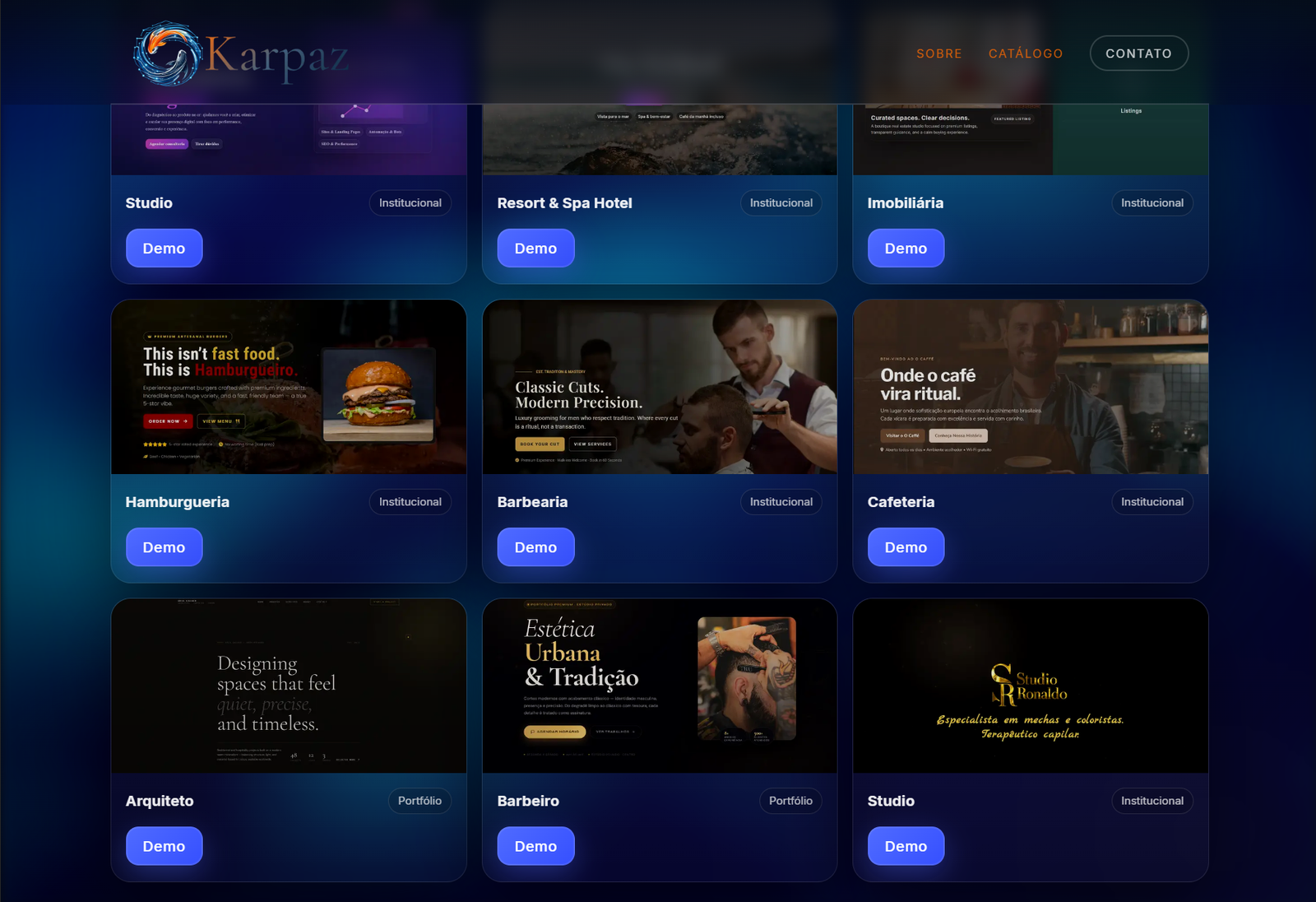
Template catalog by industry, each with a live demo so clients can see the result.

Responsive layout that keeps visual hierarchy, contrast and usability on smaller screens.
Karpaz needed a stronger digital presence that could communicate value, professionalism and commercial direction clearly.
A landing page was created with an objective narrative, premium visuals, strategic sections and a structure ready for more content and services.
The project gave the brand a stronger visual and commercial foundation, making it easier to present, attract clients and grow.
Expanding, with room for new sections, case studies and commercial integrations.
The Karpaz landing page was designed as a strategic showcase: beyond presenting services, it shapes how the brand's value is perceived, creates consistent visual communication and prepares the ground for new products, case studies and sales channels.
Interface built with HTML, CSS, JavaScript and Bootstrap, prioritizing reusable components, well-defined sections and responsiveness.
A simple structure ready to evolve, allowing future integration with forms, a CRM, internal pages and lead capture.
At this stage the project doesn't need a database. The priority was a light, fast and easy-to-maintain business site.
As a light business landing page, the project keeps technical exposure low and avoids unnecessary dependencies.
Organizing the page into sections makes future integrations easier without compromising the existing visual base.
Links, buttons and visual hierarchy focused on clarity, basic accessibility and straightforward navigation.
Defining a more premium language, with contrast, depth and a strong identity.
Organizing the main sections to present the brand, its services and its value proposition.
Adjustments to keep readability, visual impact and navigation consistent on desktop and mobile.
Preparing the base for new case studies, commercial integrations and future pages.
<body>
  <?php require __DIR__ . '/nav.php'; ?>

  <main class="wrap">
    <!-- HERO -->
    <section class="hero" id="top">
      <img src="/img/Karpaz.png" alt="Karpaz">

      <p>
        Sites modernos e acessíveis para microempreendedores — feitos para transmitir profissionalismo e atrair clientes.
      </p>
      <div class="cta-row">
        <a href="catalogo.php" class="btn-primary">
          Catálogo
        </a>
      </div>
    </section>

    <!-- ABOUT -->
    <section class="first-section reveal" id="about">
      <div class="grid">
        <div>
          <h2>Sobre</h2>
          <p>
            A Karpaz ajuda pequenos negócios a se posicionarem online com confiança.
            Criamos sites rápidos e objetivos que contam sua história com clareza — e transformam visitantes em clientes.
            Processo simples, comunicação direta e resultado real.
          </p>
          <button onclick="window.location.href='sobre.php'"  class="lstbtn">
            <span>SOBRE</span>
          </button>

        </div>

        <div class="media media--about" aria-hidden="true">
          <div class="chip">Design + Desenvolvimento</div>
        </div>
      </div>
    </section>

    <!-- WORK -->
    <section class="second-section reveal" id="work">
      <div class="grid reverse">
        <div class="media media--work" aria-hidden="true">
          <div class="chip">Rápido • Responsivo • SEO</div>
        </div>

        <div>
          <h2>Trabalhos</h2>
          <p>
            Landing pages, sites institucionais simples, páginas de serviços/cardápio, funis com foco em WhatsApp — tudo pensando em velocidade, mobile e confiança.
          </p>
          <button onclick="window.location.href='contato.php'" class="lstbtn">
            Entre em contato...
          </button>
        </div>
      </div>
    </section>
  </main>

<?php require __DIR__ . '/footer.php'; ?>/* --- Hero --- */
.hero{
position:relative;
overflow: hidden;
isolation: isolate;
padding: clamp(70px, 10vw, 180px) 0 clamp(70px, 10vw, 180px);
min-height: clamp(520px, 70vh, 760px);
}
.hero > *:not(.float){
position: relative;
z-index: 2;
}
.hero img{
width: 20rem;
height: auto;
display: block;
margin: 0 auto;
}
.hero h1{
margin:0;
font-family:"Cormorant Garamond", serif;
font-size: clamp(48px, 7vw, 92px);
line-height:.92;
font-weight:500;
letter-spacing:.2px;
text-align:center;
text-shadow:0 10px 40px rgba(0,0,0,.35);
}
.hero p{
margin: 18px auto 0;
max-width: min(640px, 92vw);
text-align:center;
color:var(--text);
font-size: clamp(15px, 1.6vw, 18px);
line-height:1.6;
padding-inline: 10px;
text-shadow:
1px 2px 20px rgba(0,0,0,.9),
-1px -2px 20px rgba(0,0,0,.9);
}/* Responsive breakpoints */
@media (max-width: 980px){
.footer-inner{ grid-template-columns: 1fr 1fr; }
.grid{grid-template-columns:1fr;}
.reverse{text-align:left;}
}
@media (max-width: 780px){
.float{display: none;}
.footer-inner{
grid-template-columns: 1fr;
justify-items: center;
gap: 14px;
}
.footer-nav-right{ justify-content:center; }
.brand-card{ width: min(360px, 92vw); }
.brand a img{
height: 60px;
width: auto;
}
}
@media (max-width: 640px){
.hero{padding: 70px 0 70px;}
.float.c{
position:relative;
right:auto; top:auto;
width:100%;
height: 360px;
margin-top: 22px;
}
.wrap{
padding-bottom: 36px;
}
.first-section{
margin-top: 18px;
padding: 22px 0;
}
.second-section{
margin-top: 48px;
padding: 22px 0;
}
.grid{
padding: 34px 0;
gap: 18px;
}
.hero{
min-height: auto;
padding: 56px 0 56px;
}
.cta-row{
margin-top: 18px;
}
}Karpaz gained a stronger business presence, a better presentation of its value and a structure ready to evolve with the brand.
The project reinforced the importance of turning positioning into interface: every section has to communicate value, not just fill visual space.