Problem
The firm needed a digital presence that presented its identity, practice areas and legal content in a professional, clear way across devices.
technical case study
Website • Business website / Law firm
Business website for a law firm, with its own visual identity, a presentation of its practice areas, legal articles and contact channels.
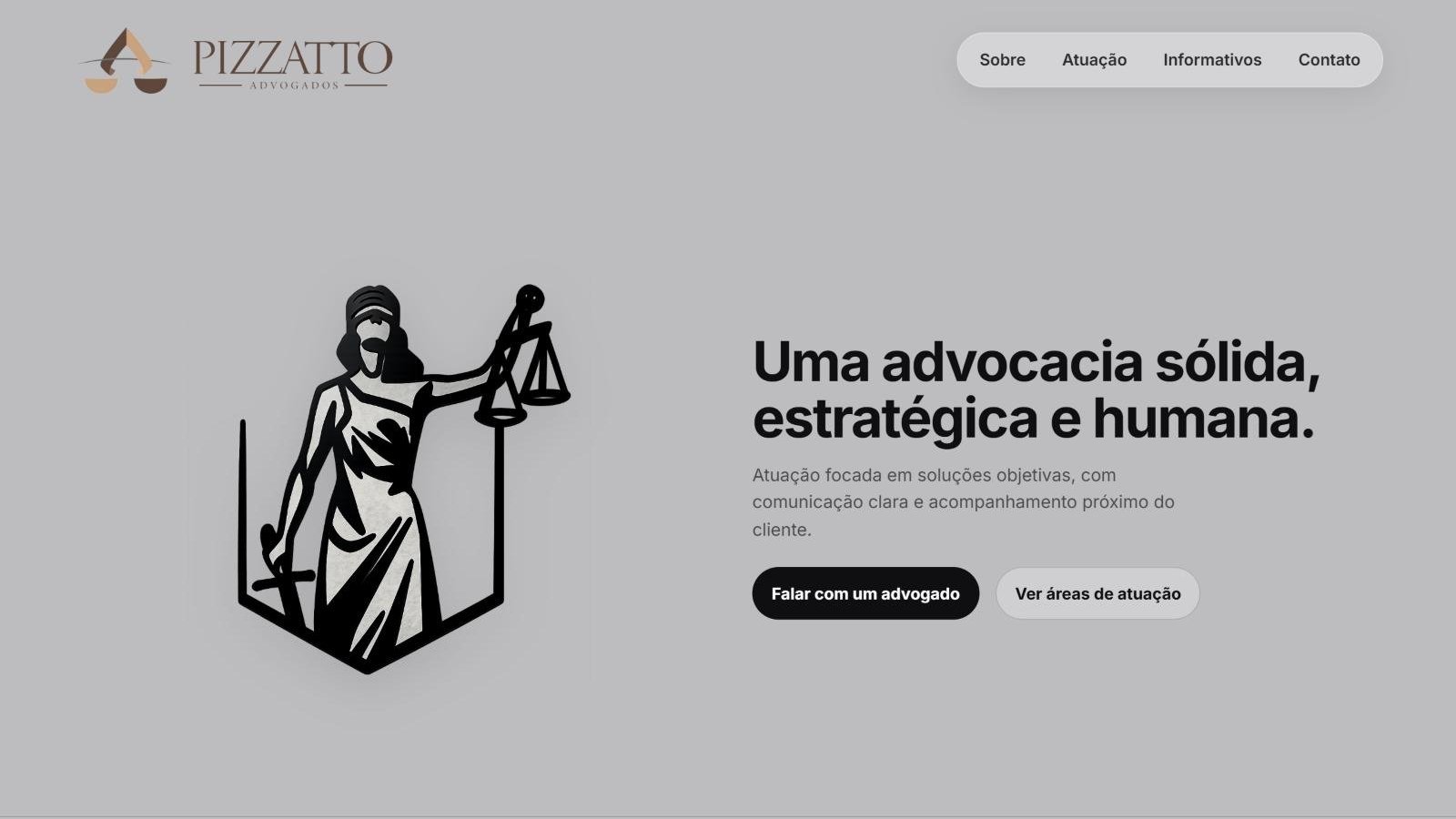
Home page with its own visual identity, a direct institutional message and access to the firm's main areas.
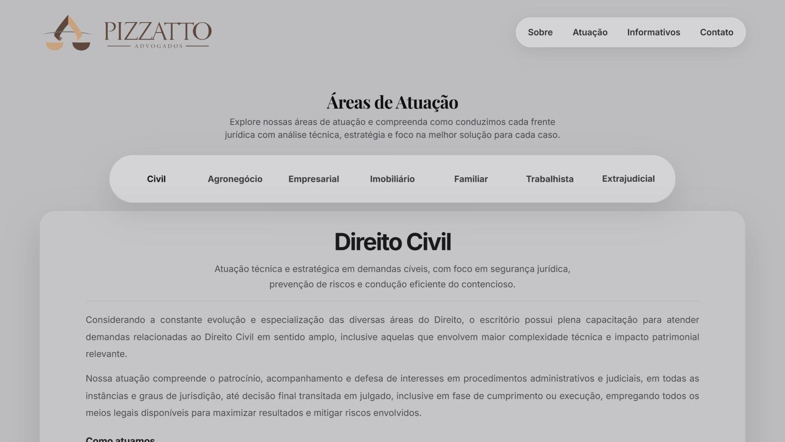
Organized presentation of the legal specialties, with navigation by area and detailed content.
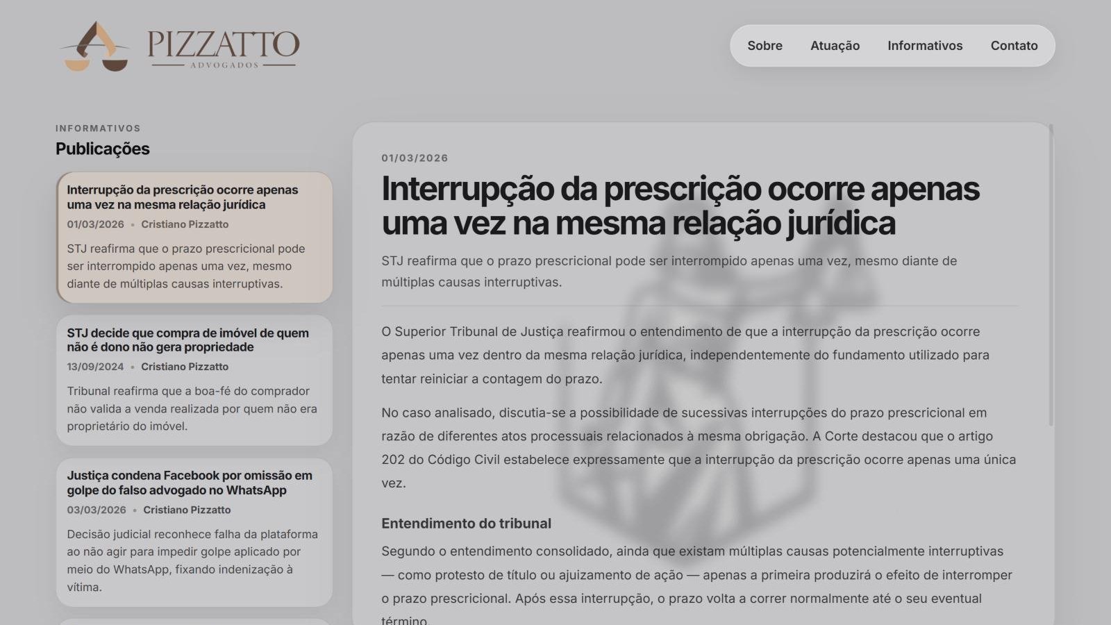
Editorial area that gathers legal articles and offers detailed reading without leaving the page.
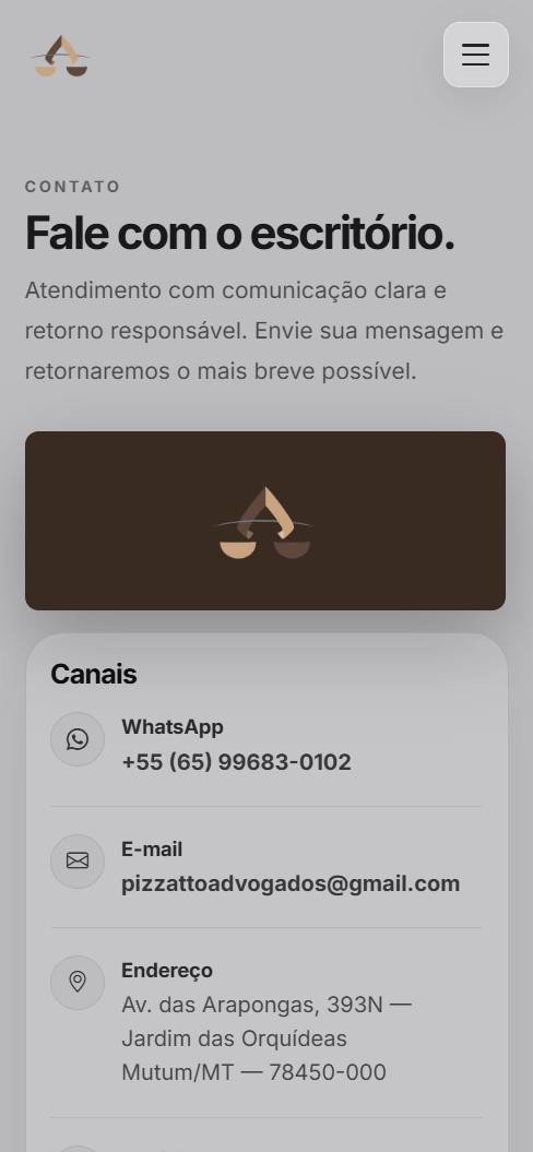
Contact page with direct channels, a form and location, adapted for smaller screens.
The firm needed a digital presence that presented its identity, practice areas and legal content in a professional, clear way across devices.
A responsive business website was built with straightforward navigation, dedicated pages for the firm and its specialties, an articles area and centralized contact.
The site was published on its own domain, bringing together the firm's presentation, legal content and contact channels in a consistent visual experience.
Live site, with a structure organized for maintenance and new content.
Pizzatto Advogados was designed to communicate solid, strategic and human legal work without an overly formal or cluttered interface. The work combined a sober visual language, institutional content and navigation built around what visitors need to understand the firm's services and get in touch.
Interface built with HTML, CSS and JavaScript, including visual components, interactions in the articles area, responsive navigation and mobile-specific adjustments.
Pages organized in PHP, with shared components such as navigation and footer. The structure separates the institutional areas and handles the contact form on the server.
A light business structure that doesn't need a database to display its pages. Articles are presented in a custom listing and reading interface.
The form flags required fields and the email format, giving users feedback before they submit.
The form only asks for name, email, subject and message, keeping the first contact simple and direct.
Separating pages, styles and shared elements makes maintenance and reviewing interface changes easier.
Defining the visual language and how the firm is presented, considering typography, contrast and brand elements.
Building the home page, the firm's presentation and the organization of its practice areas.
Implementing the articles area and refining interactions for reading articles of different lengths.
Structuring the contact channels, form and location, and adjusting the layout for mobile devices.
Reorganizing styles per page, final interface adjustments and publishing the site on the firm's domain.
The firm now has a live business website that brings together its positioning, specialties, articles and contact in a consistent, adaptable experience.
The project highlighted the importance of balancing visual language, content density and maintainability: a business interface has to inspire trust without getting in the way of information.